Design Manner

Design Manner

Design Manner featuring great design, architecture, fashion, graphics and innovation from across the globe.


To Beauty

To is a skincare brand inspired by the life and mystery of the cosmos and the meditative experiences of the spirit. A mystical color palette, organic symbology that expresses the pulse of life, even the inside the cap, which receives little attention, is beautifully designed in a crescent shape. The specially structured screw nozzle of the facial cleanser ejects an ideal dense foam with a single push, which maintains elasticity for a long time and reduces skin irritation from friction. The eyelash beauty serum uses an innovative airless container that is preservative-free and hygienic.

Continue reading


Stacked Glyphs

In Chinese culture, a special type of character called Stacked Character refers to the character formed by overlapped glyphs. Most of these superimposed characters are uncommon and are gradually replaced by commonly used characters nowadays. So that Stack Glyphs constructed the characters using graphical symbols, collected these lost chinese characters.

Continue reading


Big Dream

This visual design pays tribute to Asian Pacific American Heritage Month with a blend of traditional and modern styles that captures the essence of classic Chinese art. Nuanced brushstrokes showcase the beauty and depth of this art form. The study exhibits a balance of sophistication and cultural significance that is synonymous with Chinese calligraphy, highlighting its relevance to Asian culture. The design language is timeless, merging art and design to connect to the beauty of the past while forging a path towards the future, in celebration of the Asian Pacific American culture.

Continue reading


Master Ji Gong

It's a movie trailer poster designed for a 2021 Chinese animated fantasy adventure film Master Ji Gong, directed by Liu Zhijiang and Qiao Yu. Inspired by Zhao Zhixin, a poet of the Qing Dynasty, Poetry is like a magic dragon. You can see its head but not its tail, or just a claw and a scale in the cloud, Chinese ink has been extensively used in order to accurately capture the romantic charm of the dragon and the deity in the movie, and relationship between the monk and dragon, the beauty of ambiguity, the connotation deeply rooted in as well.

Continue reading


Virtual and Reality

Virtual and reality are antonyms. By dismantling the font strokes and using the tools used in the design as the structure of the font, it reflects the conflict between abstraction and reality in the design work process, but will eventually find its own positioning and goal. This is an interpretation of the virtual and real visual image design exhibition of the design creation process.

Continue reading


Animated Koopmans Logo System

Koopmans asked Rebrandt to communicate the breadth of the range more clearly. The word "print shop" no longer represents what they do. This new ID is therefore not only an aesthetically appealing design language but also a strategic marketing instrument that communicates the wide range of products they can offer. Ruud Winder, head of design Rebrandt, wanted the dynamic working attitude of the organization to be reflected in the designs. The movement contrasts with the supposed stillness of a print company, precisely that breadth had to be emphasized.

Continue reading


World's best designers, artists and architects.

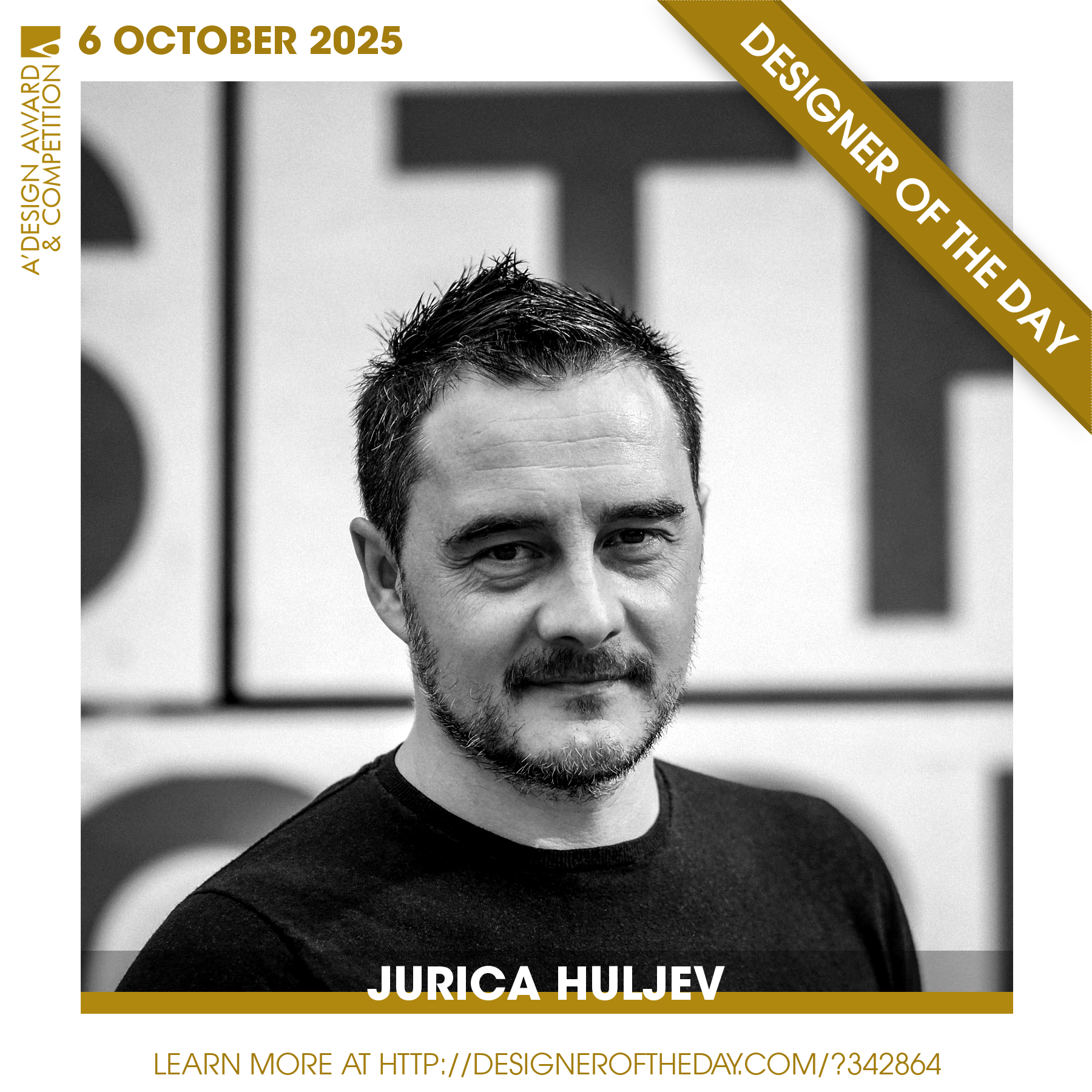
Good design deserves great recognition. Everyday, we are pleased to feature amazing designers who create original and innovative designs, amazing architecture, stylish fashion and creative graphics. Today, we are presenting you one of the World’s greatest designers. Checkout an award-winning design portfolio today and get your daily design inspiration.

Continue reading