Design Manner

Design Manner

Design Manner featuring great design, architecture, fashion, graphics and innovation from across the globe.


Lalique

Conceptual Calendar for French premium glass manufacture Lalique. Connecting the world of unique handmade glass production by a premium manufacturer and the world that is entirely handmade from paper. To create an amazing imaginary space in which the luxurious world of glass and visual art is combined. Together with perfect printing technology, large format, special effects and surface treatments, they form a breath-taking story that will entertain you all year long.Great attention was paid to every detail and also on extremely precise processing and the top-quality print result.

Continue reading
 

Dotline

Dotline has been facing a huge business challenge, which is as same as others in the welfare industry: a shortage of human resources. This identity system design is to inspire a company’s vision to their staff, candidates, and related people. The company’s vision is Social Heroes. Dotline sees all staff who come for help in someone's daily life as heroes. The logo is a graphical symbol of a hero flipping a cloak and moving forward designed from the letters, D+L. As Dotline provides 7 business categories, the logos come in 7 different colors with each business name typed with a brand typeface

Continue reading


Sabbioni Branding

Grafiche Sabbioni required a new brand position to celebrate the firm's 60th year anniversary. Salt&Pepper worked with the company to create modern visual languages to promote this important milestone, highlighting the brand’s capabilities in sustainability in the box and traditional print processes. Salt&Pepper created an energetic, robust, and positive branding system, creating a line of 100 percent sustainable, using water-based inks and minimal paper waste to promote the company's core values.

Continue reading


SUMMER PALACE TOUR

The design team used 2.5D style to draw the three major architectural clusters in the Summer Palace, covering more than 20 traditional Chinese buildings in total, using black, red, and green colors to create a colorful visual experience. We also introduced the concept of "Small Hand-carry", hoping that visitors can easily play around the Summer Palace, holding the history in the palm of their hands, taking the beauty of the scenery at their fingertips, and carrying good gifts in their hands.

Continue reading


Terra

The curvilinear logo design with the theme of aroma drifting from the environment expresses a natural and high quality coffee experience. The individual labels are designed with a collage of local photographs that connect the producer's face with the place of origin, environment and consumers, and convey the individuality and charm of the unique coffee produced in each region.

Continue reading


Better Bodies Hi

Better Bodies Hi is a workout studio. They needed to create an environment where users after office work could gradually prepare their body and mind towards exercise. Therefore, they designed a typeface that transforms in three stages. As users move from the reception to the workout area, the typeface of the sign gradually changes to a thicker and larger. The typeface gradually guides and encourages the user to work out. They used this typeface in logo, website, and products, to create a brand identity.

Continue reading


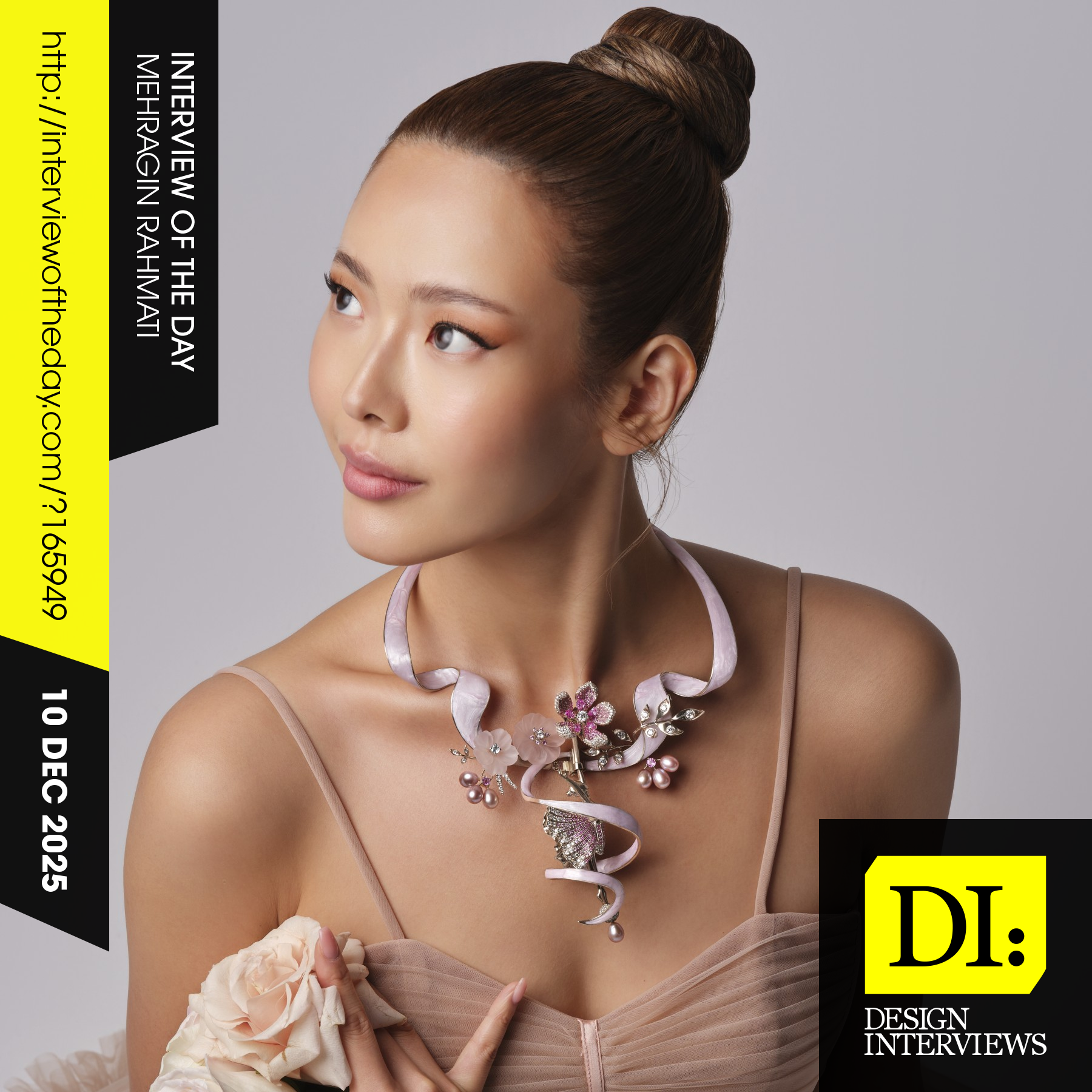
Design interview of the day

Read the latest interviews and conversations on design, creativity and innovation between design journalist and world-famous designers, artists and architects. See latest design projects and award-winning designs by famous designers, artists, architects and innovators. Discover new insights on creativity, innovation, arts, design and architecture. Learn about design processes of great designers.

Continue reading